Document
Document Overview
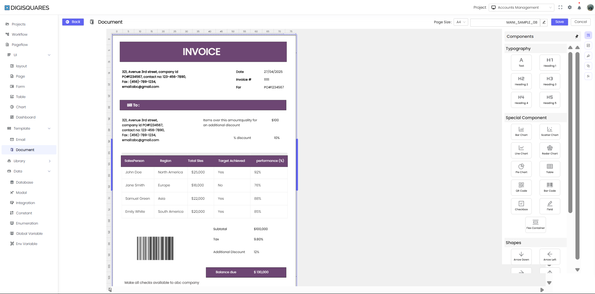
In the DIGISQUARES platform, the Document section is designed for creating and customizing various types of documents using a drag-and-drop interface. Users can integrate charts, tables, text fields, images, and more, making it ideal for creating invoices, forms, and other document-based outputs.
Example Chart Visualizations
Here are some example visualizations created using Digisquares:
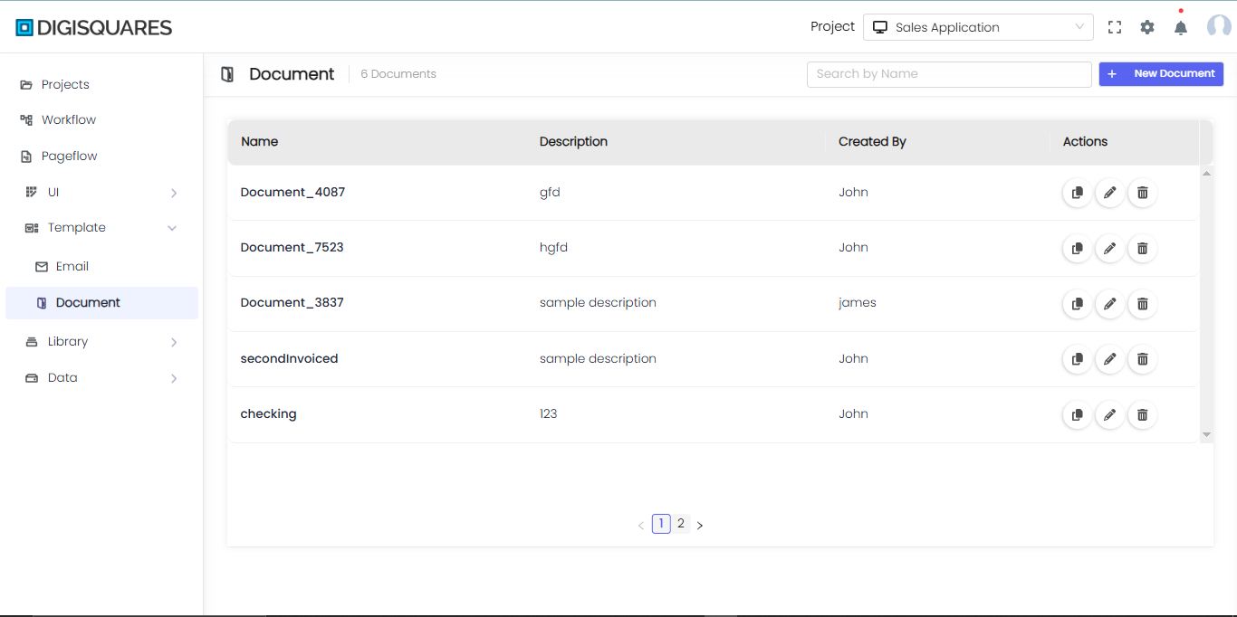
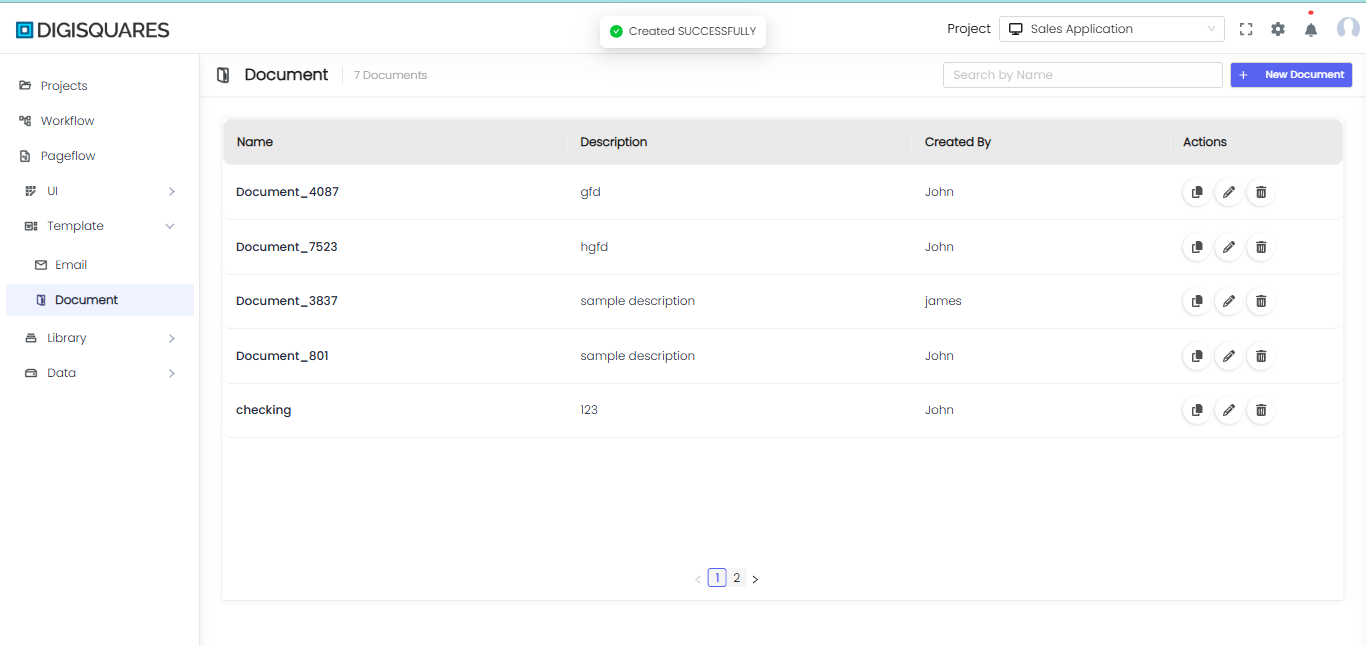
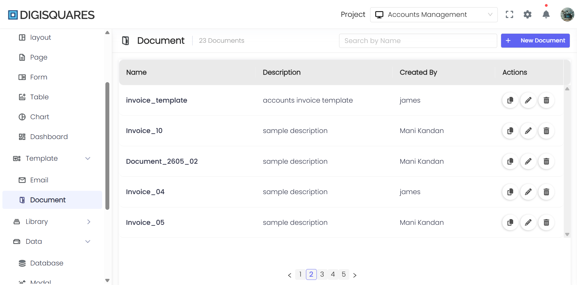
Accessing the Document Menu
- Navigate to Digisquares and log in.
- On the left sidebar, click Template > Document to open the Document Menu.
- Click + Blank Document to create a new document UI.
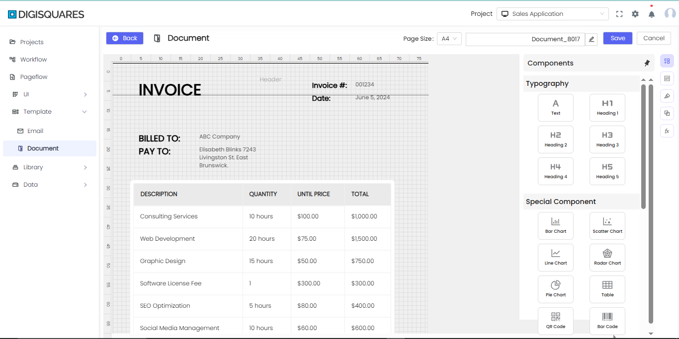
Step-by-Step: Creating a Document
Step 1: Open the Document Module
- From the left sidebar, click Document to open the document design interface.
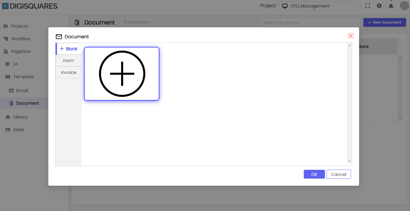
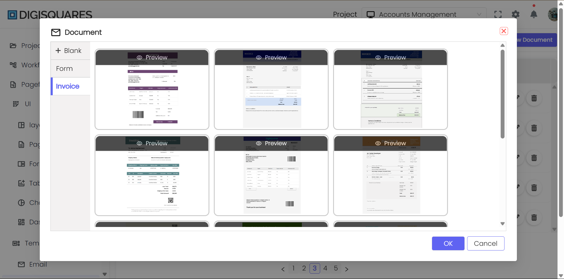
Step 2: Select or Create a New Document
- At the top, name your document or confirm the existing name.
- You can choose from various types of documents:
- Blank Document for creating a document from scratch.
- Form for designing interactive forms.
- Invoice for creating professional invoices.
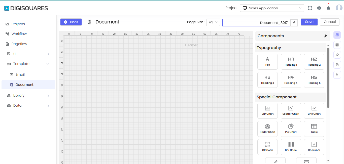
Step 3: Adding Components to the Canvas
- From the Components panel on the right, drag and drop elements like:
- Row for structuring content in horizontal sections.
- Box/Code for embedding code snippets or styled content blocks.
- Section for grouping related items.
- HTML for custom HTML formatting.
- Flex Container for responsive layouts.
Step 4: Incorporating Shapes and Visuals
You can add various shapes, including:
- Bar Chart, Pie Chart, Table to present data visually.
- QR Code, Barcode for quick access to links or scanning.
Step 5: Positioning and Resizing Elements
- Drag each component to the desired location on the grid.
- Resize or align them according to your document’s layout.
Step 6: Configuring Properties and Styles
- Select a component to reveal its properties or styling options.
- Adjust text, colors, borders, or data bindings to match your document’s design.
Step 7: Previewing Your Document
After adding all components, you can preview the document layout. Ensure that elements like text and images are aligned and displayed properly.
Step 8: Saving and Finalizing
- Click Save in the top bar to store your changes.
- If you need to discard changes, click Cancel.
Step 9: Exporting or Publishing the Document
Once finalized, you can export the document in formats such as PDF or print it directly. Depending on your workflow, the document may also be integrated into automated processes.
Special Document Features
Typography & Components
- Typography: Select from heading tags like H1, H2, and H3 to structure your document.
- Special Components: Add functional components such as charts, QR codes, and checkboxes for interactive documents.
Component and Purpose
Typography
-
Text Inserts a basic text block or paragraph. Ideal for regular body text, descriptions, or any non-heading content.
-
H1 (Heading 1) Inserts a top-level heading. Used for the main title of a page or section. It’s generally the largest and most important heading.
-
H2 (Heading 2) Inserts a second-level heading. Used for subheadings under H1. Often breaks down main content into major sections.
-
H3 (Heading 3) Inserts a third-level heading. Used for further subdivisions under H2 headings.
-
H4 (Heading 4) Inserts a fourth-level heading. Used for smaller sections or subtopics under H3 headings.
-
H5 (Heading 5) Inserts a fifth-level heading. Used for detailed or nested subtopics under H4 headings.
Special Component
-
Bar Chart Displays data as horizontal or vertical bars. Ideal for comparing different categories or showing changes over time (e.g., monthly sales, survey results).
-
Scatter Chart Plots points to show the relationship between two variables. Useful for data analysis to see correlations, distributions, or trends in pairs of data points (e.g., height vs. weight).
-
Line Chart Shows data as points connected by straight lines. Commonly used for visualizing trends or changes over continuous time (e.g., stock prices, temperature changes).
-
Radar Chart Plots multiple variables around a circle, with each variable having its own axis. Great for comparing multiple attributes or metrics (e.g., skill evaluations, performance metrics).
-
Pie Chart Displays data in a circular graph, with slices representing proportions of a whole. Best for showing percentages or parts of a whole (e.g., market share, budget distribution).
-
Table Organizes data into rows and columns. Good for structured data where direct comparison or detailed reference is needed (e.g., product specifications, price lists).
-
QR Code Inserts a QR code image that can be scanned to open a link or display text. Useful for providing quick access to websites, download links, or additional resources.
-
Bar Code Inserts a machine-readable code representing data (usually numeric). Commonly used for inventory management, product identification, or membership tracking.
-
Checkbox Inserts an interactive checkbox. Ideal for forms, to-do lists, or anywhere a user needs to indicate a choice/selection.
-
Field Likely a text or data entry field (exact functionality may vary depending on your system). Allows users to input or display dynamic content, such as names, IDs, or custom data.
-
Flex Container Provides a flexible layout container (often using CSS Flexbox). Used to arrange child elements in a responsive row or column layout. Great for building complex UI sections where items need to adapt to different screen sizes.
Shapes
-
Arrow Down Often used to indicate downward movement or direction in a diagram.
-
Arrow Left Points left to indicate backward movement, previous steps, or navigation.
-
Arrow Right Points right to indicate forward movement, next steps, or navigation.
-
Arrow Up Often used to indicate upward movement or direction.
-
Ellipse A circle or oval shape, frequently used to represent start/end points in flowcharts or highlight content.
-
Hexagon A six-sided polygon, sometimes used for specialized diagram elements or unique design accents.
-
Parallelogram A four-sided shape with opposite sides parallel, often used to represent input/output in flowcharts.
-
Pentagon A five-sided polygon, less common in standard diagrams but useful for custom shapes or highlighting.
-
Rectangle One of the most common shapes, often used for process steps in flowcharts, text boxes, or containers.
-
Square A special case of a rectangle with equal sides, good for visually balanced elements or checkboxes.
-
Star Adds a decorative or attention-grabbing element, often used for highlights, ratings, or special callouts.
-
Line A basic straight line, useful for connecting or dividing elements in a diagram or layout. -->
Styling the Document
Use the Styles panel to adjust the layout, spacing, borders, and typography. Apply Inline Styling to ensure consistency across different sections of your document.
Best Practices for Document Creation
- Use Headings for Structure: Use H1, H2, and H3 tags to organize sections of your document clearly.
- Interactive Elements: For forms and invoices, integrate checkboxes, fields, and tables to enhance interactivity.
- Visual Representation: Use charts and graphs to represent data clearly and professionally.
- Responsive Design: Ensure the layout adjusts to different screen sizes using the Flex Container.
Conclusion
The Document module in DIGISQUARES makes creating and customizing professional documents a streamlined process. With the ability to integrate data visualizations, interactive components, and flexible layouts, users can design highly functional documents like invoices, reports, and forms with ease.