Layout
Introduction
The Layout Menu in Digisquares allows users to efficiently design and customize layouts for their projects. This guide provides detailed instructions on how to navigate and utilize the Layout Menu.

Accessing the Layout Menu
1. Navigating to the Layout Menu
- Open the Digisquares platform and log in.
- In the left-hand sidebar, locate and click on the UI section.
- Under UI, select Layout to open the Layout Menu.
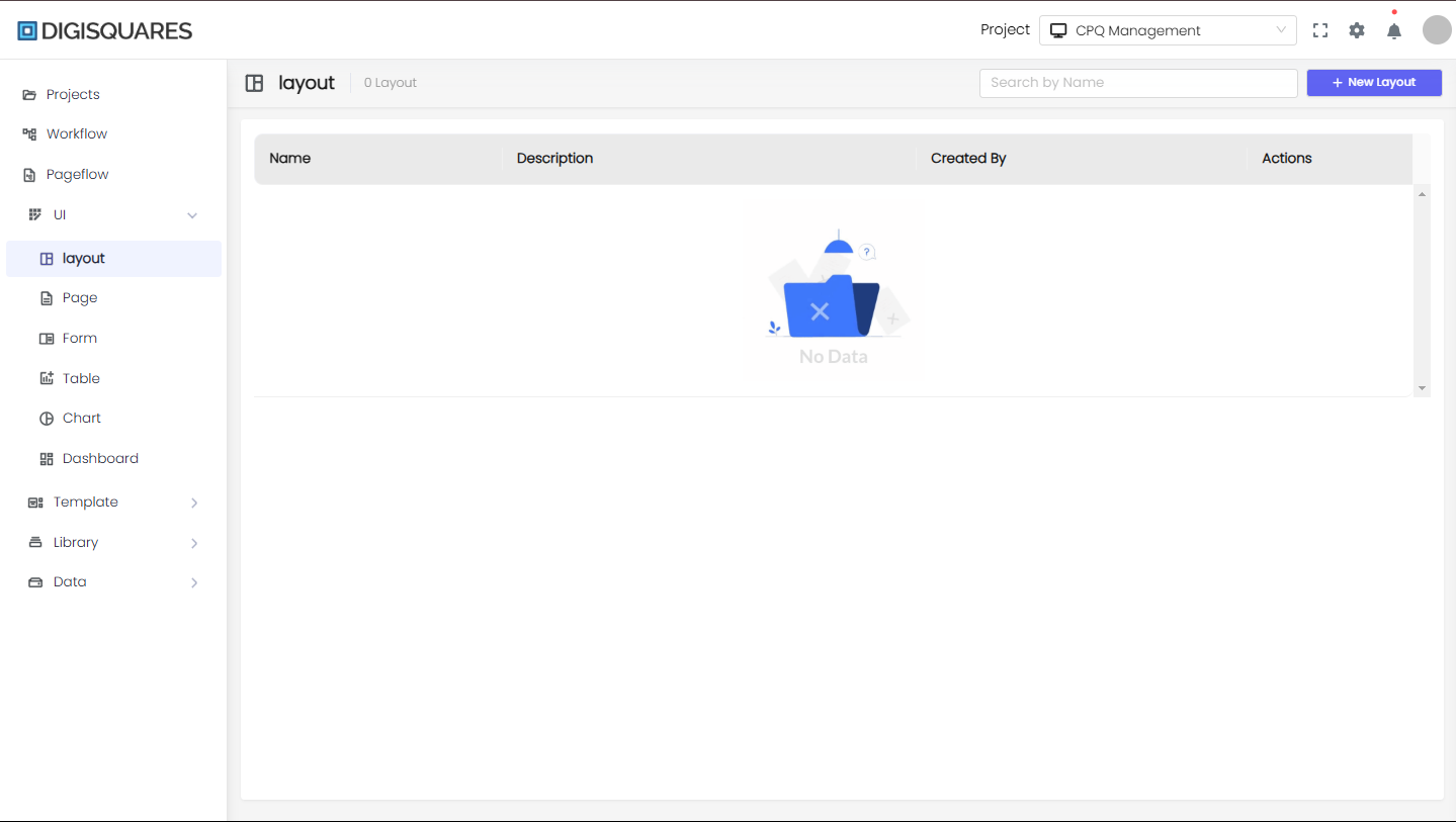
2. Layout Menu Overview
- The Layout Menu displays a list of existing layouts associated with the selected project.
- The main table shows columns for Name, Description, Created By, and Actions.
- Click the New Layout button to create a new layout.
Creating a New Layout
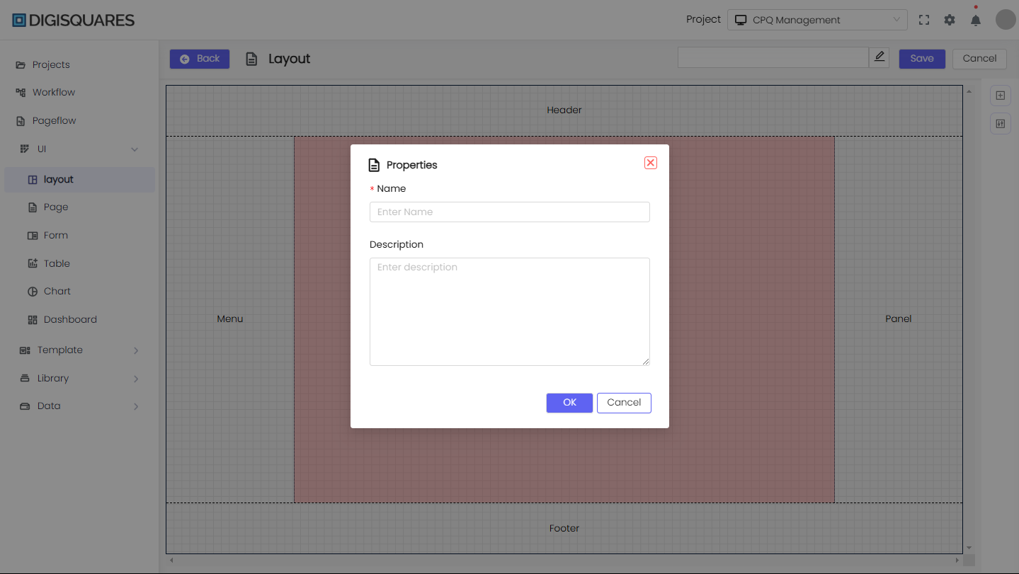
1. Starting a New Layout
- Click the New Layout button in the top-right corner.
- A modal window will appear where you need to enter the Name and Description of the layout.
- Click OK to proceed.
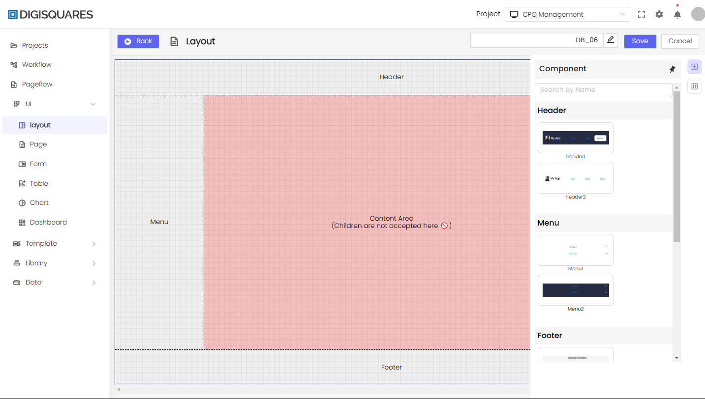
2. Designing the Layout
- After creation, the layout editor screen opens, showing a grid-based design area.
- The layout consists of predefined sections like:
- Header
- Menu
- Content Area
- Panel
- Footer
- Drag and drop components from the Component Panel on the right.
3. Adding Components
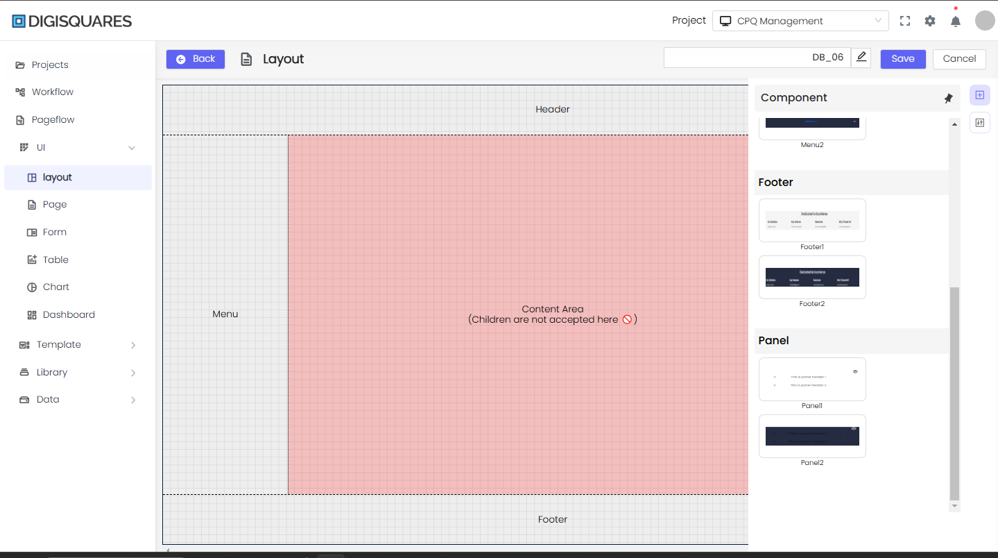
- The Component Panel contains various UI elements categorized as:
- Header: Different styles of headers.
- Menu: Menu and navigation options.
- Footer: Footer section templates.
- Panel: Content area designs.
- Drag the desired component to the corresponding section.

Finalizing the Layout
1. Customizing Layout Elements
- Click on any element to modify its properties.
- Customize its:
- Background
- Spacing
- Typography
- Borders and Shadows
2. Saving and Publishing
- Once satisfied with the layout, enter a name in the input field at the top.
- Click Save to store the changes.
- Click Back to return to the Layout Menu.
Managing Layouts
1. Editing an Existing Layout
- Locate the layout in the Layout Menu.
- Click on Actions and select Edit.
- Modify the layout using the editor and save changes.
2. Deleting a Layout
- Click Actions next to a layout and select Delete.
- Confirm deletion in the prompt that appears.
3. Previewing a Layout
- Use the Preview option to see how the layout appears on different screen sizes.
Best Practices
- Save changes frequently to avoid losing work.
- Use predefined templates for faster design.
- Ensure responsiveness by testing the layout on different screen sizes.
- Utilize component properties to refine the design.
The Layout Editor in Digisquares offers a powerful way to build structured UI layouts efficiently, making app development faster and more streamlined.